Work • Consumption & Need
What Advertising Can Learn from Art
Our societies are exercised around the question of whether the advertising industry, on the whole, is good or bad. It can be a bit disconcerting that we are relentlessly solicited by people trying to sell us things. One might in some moods wonder if the world would be a better place, if there were a lot less advertising going on. But the fact is, the amount of advertising is increasing all the time.
We want to shift the focus to a more specific and more productive question: what is a good advert? Our goal is better advertising, not less advertising.
We can answer this by considering the six key things that put people off advertising, and then looking at how these problems can be put right. Bad ads go in for:
– Shouting
– Sentimentality
– Cliché
– Sexual vulgarity
– Nastiness (which means giving encouragement to the less admirable sides of human nature, like snobbery and selfishness)
– Boosterism
These are the six things that people tend not to like and resent in ads that go in for them. These are the things that inadvertently undermine an advert’s power to persuade and to sell. They are, in their way, commercial errors.

Oddly, some big clues to fixing these selling errors can be located in art. Art seems a strange place to turn because we generally suppose that art and advertising are polar opposites. A car insurance billboard seems light years away from, say, the National Gallery of art in London or Washington. Artists usually take a dim view of Capitalism while advertising agencies are central to it.
But below the surface there’s a shared ambition. Art often gets us to like things. A work of art is frequently trying to get us to share an enthusiasm or buy into an idea. And this is what adverts are aiming at too. Over a very long time, art has developed techniques and skills around emotive persuasion. Many of the things that can go well or badly in adverts have been revealed over centuries in quite helpful ways in the world of art. Art has found solutions to many of the moves that can go wrong with advertising.
We want to look at the ways the six core problems of advertising have been resolved in art. The point isn’t to suggest that adverts should become more arty, but that they can become more effective at reaching people and selling products and services by absorbing some of the moves that have been rehearsed across the history of art.
The six errors bad adverts make:
ONE: SHOUTING
When adverts shout, badger and pester they’re of course hoping to get our attention and influence our behaviour. The problem is that shouting is not usually a good strategy. It comes across as slightly desperate. We know from personal life that when we’re sure about what we have to say and we’re confident about why it’s a good idea, we get less – rather than more – shrill. We’re likely to get worked up and shouty when we don’t feel there’s much hope that the other person will find what we have to say persuasive.
In art, the advantages of not shouting have been carefully and very widely attended to.

Agnes Martin, The Rose, 1964
Agnes Martin is emphatically quiet. But she’s got plenty of notice. She’s cottoned onto the notion that inviting close attention is a great way to get heard. We lean forward to catch the whisper. So we really listen.
She’s recognised a central fact about how to get inside people’s desires – which is the great ambition of advertising. It can be hugely effective to be reserved. Actually it’s something we know about in personal life, but tend to forget in commerce. The person you want to confide in isn’t the loud, rolliking character. It’s the quietly warm individual who might be a bit hesitant, but who is discretely signalling that they are very interested in who we really are. Agnes Martin is teaching us an initially paradoxical idea: that you can sometimes communicate better by turning down volume.
Many adverts haven’t yet discovered the virtue of quiet as a strategic insight of communication.
TWO: THE ROSE-TINTED AD
There are many adverts that present a perfect view of the bit of life in which the product or service they are promoting is supposed to fit. They suggest that families are entirely happy and couples are totally sweet. They insist that a holiday should be entirely lovely, a living room immaculate, a cruise an endless sequence of perfect moments.
Such ads can be accused of sentimentality because they are editing away all the grittier aspects of reality. The urge to be sentimental emerges in response to an anxiety: the worry that nothing can be attractive or appealing – in fact loveable – if there are any problems around it at all. At certain points in the past, there was quite a lot of sentimental art around.

Artists don’t know how to do this any more… ads still have to learn (Emile Munier, Girl with Doll and Dog, 1882)
But this kind of art ran into a couple of serious problems. The over-insistence that something is perfectly lovely readily produces the opposite effect from the one intended. Instead of being convinced, the viewer quickly becomes sceptical and cynical. The rose-tinted image starts to look a bit like a cover-up.

William-Adolphe Bouguereau, Idylle, 1851
Instead of being enchanted by the perfect, unchanging love and fidelity of this couple, audiences soon started having the reverse ideas: she’s having an affair, but hasn’t made up her mind to tell him or they assumed the artist might be untrustworthy and lacking in insight: if this was his idea of love, he obviously couldn’t be relied upon to know much about it.
The sentimental ad runs the risk of making people cynical and disappointed around products. So there are people it doesn’t reach at all well or people who get resentful because they sense that the product has been oversold. Sentimentality is commercial strategy that brings a submerged set of risks with it.
From the early 20th century, art learned the lesson and sentimentality almost completely disappeared from gallery walls. The solution isn’t to focus remorselessly on what’s grim. Instead, the idea has been to help us see what could still be very sweet and attractive about what’s otherwise ordinary and very far from perfect.
In Kay Westhues’s famous image of children blowing bubbles we’re made aware that things could be a bit tough at times around these children. The older one might be really quite mean to the younger one at times; getting out the door to go to school could involve tantrums. But the loveliness of this unusual moment of tranquility has been held onto. The artist is confident that we’ll recognise that some things are extremely nice – even though they are not perfect. Indeed, the admission that things aren’t perfect is precisely what will help us to trust in the authenticity of what is being proposed as properly good.
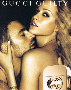
THREE: THE SEXUALLY VULGAR AD
Sex is frequently used to sell us things. We’re not saying don’t use sex to sell. Clearly it works and taps into some aspects of our natures it would be best to accept rather than rail against. It can sound like a paradox, but the lesson from art isn’t to avoid sex. It’s that there’s a lot more potential around using sex to sell than most ads seem to have realised. Art has been good at identifying the less obvious ways that people can be sexy. It finds sex-appeal in slightly overlooked places.

William Eggleston, Untitled, 1960-1965
The US photographer William Eggleston was good at locating where sexual allure might be lurking. The couple in the corporate hallway aren’t conventionally good looking or glamorous. But there’s an erotic undercurrent.
[image-sidebyside]

[/image-sidebyside]
Michael Peter Ancher, A Young Girl Reading, Maren Sofie Olsen (1885); Gucci advertising campaign
Saying an ad is vulgar isn’t really a complaint about sexiness per se. What’s actually bothering people is where the ad is turning to in order to get us excited. The young woman reading in the work of the famous Danish painter, Michael Ancher, is sexy – in an unobvious way. The work is showing a bigger understanding of people – one that knows that sexual attraction is quite wide ranging and encompasses aspects like reading quietly.
Art reminds us that we can play the sensuality move for a great many audiences that may not yet have been reached by the more conventional approaches of advertising.
FOUR: THE CLICHED AD
This is the kind of ad that picks up on some very well-established features, which everyone has already noticed. It tells us that the car is good, because it can go from 0 to 70 in just a few seconds, that the computer is desirable because its memory is vast and fast and that the washing machine should be yours because it makes clothes extra clean.
These are good qualities. The trouble is, advertisers are not homing in on any fresh reason why someone might love a product. And, therefore, they miss customers and opportunities to emotionally cement people to products.
We can see the fixing of cliché in action around portraits. Usually a portrait is trying to show what’s nice about a person. The question is, what ideas of niceness does the artist have in mind?
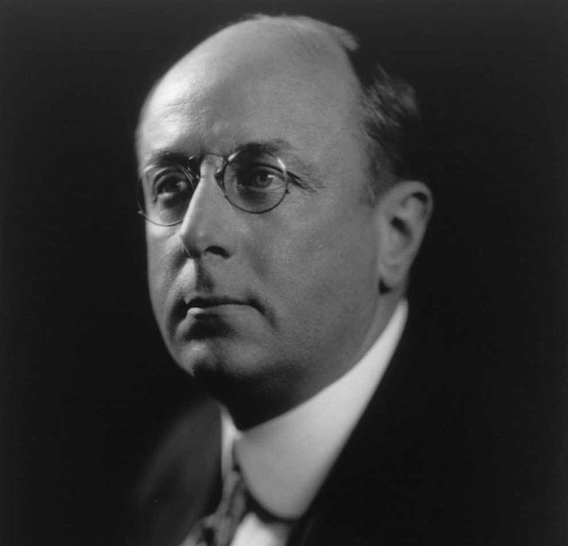
The official photo of the 55th US Attorney General, Homer Stille Cummings, was keen to show what was good about the man. And to this, it draws on a list of familiar – and clichéd – qualities – respectability, honour, dignity. They are genuinely admirable facets. The problem is they miss quite a lot of other things that we actually do very much like about people.

Robert Kennedy
By the time photo portraits were done of the 64th Attorney General, Robert Kennedy, art had learned this lesson. The image is alive to facts that – at that time – people sort of knew but were in the habit of brushing aside. It’s actually extremely lovely that Robert Kennedy was a warm-hearted father and put up his daughter’s wonkily sweet artwork in his very grand office. It’s attractive that he rolls up his sleeves before checking the clauses of the 1962 Manpower Development and Training Act.
The error of cliché is that it misses very real and powerful ways in which we find things nice. In Paris, in the 1880s, everyone wanted to live on the lower and middle floors of apartment buildings. These had prestige. A lot of selling was based on how nice the view was onto the street. Nobody wanted to live on the top attic floors – with windows to the back. Usually that was where well-off people made their servants live. The rent was minimal in comparison with the grander floors below.

Then artists started to draw attention to some rather unexpected things. Paul Cézanne lived in an attic. But he didn’t think it was a problem. It was his ideal choice, because he started to detect some surprisingly lovely aspects to the views. He liked painting the vista over the chimney tops and sky lights and ridges of the neighbouring roofs. He wasn’t hostile to the facade: in Paris they are nice too. But everyone was on to that. What Cézanne was doing was discovering another really nice thing.

Paul Cézanne, Rooftops of Paris, 1881
It was a huge commercial insight: today, penthouse apartments very often have the highest rentals – thanks to the art-adverts of Cézanne and other artists.
Cézanne wasn’t making it up. He was sensitive to a very appealing feature that a clichéd approach to selling had missed.
FIVE: THE NASTY AD
What is nastiness? It’s encouragement offered to quite bad parts of ourselves. We’ve identified nastiness in a few critical but tightly defined areas. We’ve learned in recent decades to totally avoid the racist or sexist ads which, some time back, were fairly widespread.
But there are many other areas of nastiness in ads that aren’t yet so clearly outlawed:
– a lack of patience
– a dismissive attitude to certain people
– strong sense of entitlement
– snobbery and smug elitism
– the emotionally misleading advert (a watchmaker, for instance, who insinuates that the way to being a better parent is to buy one of their watches.)
The problem is ads of this type strengthen unfortunate parts of the self. Art has worked out a different strategy. Over a very long time it has discovered how to appeal to our better natures. Artists have found techniques for promoting attitudes that help us become the people we really want to be.

Christen Kobke, The North Gate of the Citadel, 1834
The Danish painter Christen Kobke, for instance, was very interested in helping his fellow inhabitants of Copenhagen move away from their natural tendencies to selfishness and snobbery. His paintings suggests how nice it is that a smart cadet lounges on the bridge with less socially elevated companions. He wanted to remind us how everyone is touched by the same things: the gentle flow of water, a mild, sunny afternoon, the comfortable pleasure of doing nothing very much around other people.
Kobke is making a useful point for our commercial environment. He’s directly addressing half-formed hopes for our lives and advancing a wise image of how to live.
One could imagine Kobke-inspired adverts for breakfast cereal, a menswear chain or a bus company (which could make use of his approach to being comfortable around strangers).
SIX: THE BOOSTERISH AD
Boosterism energetically promotes things that aren’t really very helpful to us. It loudly informs us that everyone else is keen on something or that if we don’t join in we’re a bit strange. It’s a strategy deployed to sell things like phone upgrades (when actually the old version was more than good enough) or to get us to think that we ought to want a very complicated dish at a restaurant (when actually a much plainer version would be rather nice).
Art hasn’t actually disdained boosterism. But it has deployed it in more helpful ways. Essentially, boosterism is saying: this thing is great, you should like it, other people do, don’t get left behind, and in fact there are things that deserve to be energetically promoted. It’s a question of what is being boosted.
The Japanese artist Hiroshige was a master of boosterism. One of his big projects was to talk up the appeal of rainy days.
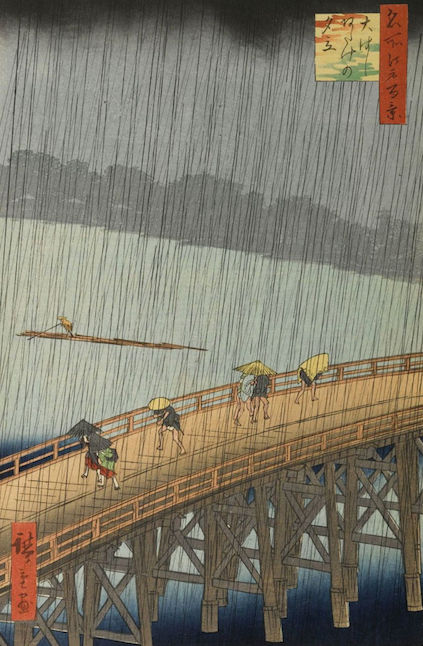
Hiroshige is advertising rain: rain is nicer than you currently think…
Rain doesn’t sell itself. We’re so attuned to the attractions of sunshine that we see rain as a misery to be avoided as much as possible. Hiroshige felt that rainy days were beautiful. He loved the way people enter their little sheltered private world under an umbrella – and how lovely it is when someone else shares that space with you. He likes the grey outline of buildings seen through the downpour. He made hundreds of boosterish woodcuts advertising rainy days.
This art lesson translates into the world of advertising, because there are lots of things we might like that aren’t yet foregrounded. We’d like to see Hiroshige-inspired campaigns boosting:
– A car that doesn’t go very fast
– A phone that’s hardly got any features
– Tourism in places that get quite cold
– A smart restaurant that serves sandwiches
The aim is to get into the foreground things that could be thought as weaknesses – and present them as desirable – because, in fact, it would be great if we had a more positive view of the less obvious virtues of people, places and things.
Conclusion
It’s nice that there’s a lot of good art around that’s learned skills of effective persuasion. But art isn’t actually the most important place where good techniques can find an outlet. They’ve been rehearsed in art. But it matters a lot more that they get used in adverts. Up to the 20th century, art was big and ads were small. Now it’s the other way round. Ads constitute a very much larger part of consciousness than art. The ambitions which have been so impressive in art should now move closer to the centre of our society and our lives; the best skills should be deployed in the places where they can have the biggest positive impacts.
A better ad can’t just be worthy. It has to be a better selling instrument. And the way it can sell better is by reaching more deeply into people’s lives – in short, understanding better how people work. For this key task, the history of art is a resource waiting to be mined and put to work.