Self-Knowledge • Mood
The Psychology of Colour
Alongside the notes of the musical keyboard and the letters of the alphabet, colours provide the building blocks of our emotions. It is not for nothing that we say we are ‘feeling blue’ or ‘seeing red’. Each colour is subtly connected to a web of experiences and associations. Some of these are highly idiosyncratic: a particular yellow might remind us of a long-dead grandmother’s kitchen or a pair of boots we had as children. But others carry more universal meanings. Exploring the associations we have around colours is a way to get to understand ourselves and, as importantly, gives us a way to tell others who we are.
YELLOW: HOPE
Yellow is carefree and confident. It’s not on the defensive. It acts as a shield against despair and feelings of humiliation. It’s eager for our attention, like a happy child delighted to be at the centre of things. At times, its energy can be oppressive, but like its most famous ambassador – the lemon – there are few things it won’t enhance. The German poet Johann Wolfgang von Goethe loved yellow, considering it to be the colour of a gently hopeful attitude to life. He owned a collection of twenty yellow waistcoats, which he always twinned with white trousers – for he loved a little serenity as well.
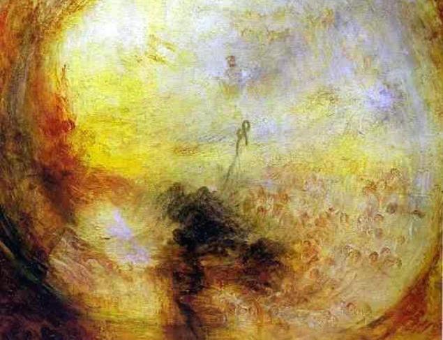
Joseph Mallord William Turner, Light and Colour (Goethe’s Theory), 1843
ORANGE: VITALITY
Orange is a little more mature, strong and threatening than its neighbour and sibling, yellow. It almost tips over into something frightening. There is much of it in the boiling interior of the sun. Yet in the correct dose, it seems like a concentration of an energy and vitality that too often we lack in our own minds and circumstances. To give over an entire room, car, flag or garment to this colour may be risky, as it can verge on extremity and obsession, and yet to deny the occasional wisdom of the colour seems wrong as well. We should know how to build in moments of what orange represents into a well-balanced life.
LIGHT RED: ADVENTURE
A bright, light red is adventurous, witty, even a touch heartless. It’s not too bothered by what others think. And that’s a tonic when, as is so often the case, we are excessively anxious about the opinions of other people. Light red is not harsh, just independent. It’s more interested in being followed than in being a follower. It’s the colour of your banner when you feel you can take on the world (or some part of it that matters to you).

Jean-Auguste Dominique Ingres, Bonaparte, First Consul, 1804
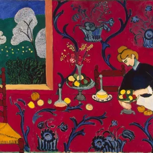
DARK RED: POWER
When Napoleon crowned himself Emperor of France in 1804, he wore a splendid crimson velvet cloak. This is the colour of thrones, of cardinals, of power and pomp, of ceremony and feasts. Dark red is sympathetic to authority and favours the idea of maturity. It is assertive and assured, and can function as a reminder of a more demanding, insistent attitude when, through misfortune or our own mistakes, we falter. It speaks to the fragment of a Napoleonic attitude buried in everyone’s soul.
VIOLET: AMBIGUITY
Violet is red that has almost been transformed into blue. It holds a little onto both, it remembers both, which makes it mysterious, ambiguous and suggestive. Early Renaissance artists liked to depict angels, busy on errands of mercy between heaven and earth, as wearing violet gowns. The colour evoked for them the idea of an infinite ‘beyond’ that was not threatening or dangerous, somewhere we could long for but which remained always just out of sight.

Paolo Veronese, The Dream of Saint Helena, 1570
LIGHT BLUE: CLARITY
Light blue is inescapably the colour of a clear, morning sky – with a cool hint, perhaps, of the north or the mountainside. It’s a colour for being active. It’s undaunted, cheerful, ready to get on and face all the things you’ve been putting aside. Shadows, confusion, doubts and second thoughts go into hiding when light blue appears. It is never cruel, just filled with breezy goodwill. It is logical, clear. It admires the simple, straightforward statement. It wants you to tidy your desk.
DARK BLUE: DISCIPLINE
This is the colour of order and discipline. It tells us not to give up, to search for reserves of resilience. It is resolute, reliable. Dark blue doesn’t get sidetracked. It sticks to the key task, to the big point. It keeps the end in view. Strong rather than hard; courageous rather than fierce, it is civilised and directed. It is power on our side, protective and helpful. It is the colour of a good, true father.
LIGHT GREEN: SANITY
Light green has the fresh, natural feel of sanity. It is summoned when we are grateful rather than envious. When we don’t need to do down others to feel good about ourselves, and when we are more interested in finding out how things go well rather than complaining when they don’t turn out quite right. We can use this colour to help us focus on our power to do something – rather than blame others for our failings or doubt our strengths.

Paul Cézanne, Etang des Soeurs at Osny, 1875
DARK GREEN: REALISM
The soothing realms of deeper, greyer green are about realism. This word sometimes has unfortunate associations, as though it was the opposite of hope, but in fact, there’s such a thing as mature, realistic hope. This emotion tells us that things are tough, but that the worst will pass, that what we have may be good enough, that we will manage and cope despite inevitable frustrations and compromises. This is hope that has acquired a proper knowledge of the troubles of life – but hasn’t given up. It pulls us back to sobriety, to patience and moderation.
LIGHT BROWN: MELLOWNESS
This is a colour that does not want to draw attention to itself. It is conscious of times past, and feels their wistful tug. It likes quiet. It is meditative and gentle. But it is not about putting us to sleep. Light brown is our friend when we want to calm down and avoid external stimulation, so that the quieter, smaller voices of the inner world – the half memories, the tentative associations, the delicate starting moments of a new thought – can be heard.

John Constable, Cenotaph to the Memory of Sir Joshua Reynolds, 1833-6
DARK BROWN: DIGNITY
Dignity means not having to try to impress. You are sure of yourself – of who you are, and what you stand for. It might be the colour of an old mahogany table, with a clock ticking quietly in the background. Time is slow and ample, there’s no rush, no haste. Dark brown is not a hectic colour – it’s the shade of comfort or dark soil on a wet day. Not glamorous, but deeply good and reassuring. It is solid and dependable.
BLACK: AUTHORITY
Black is the perennial colour of fashion and sophistication in the modern world. It is strong, without illusions. It flirts with cynicism. It is the least naive, the least childish of colours. We need black when we want to keep our cool; we’ve seen too much already to get carried away now. It is a reminder of the appeal of being a little bit harsh, a little bit demanding and decisive. Black is lean.
**
Many of us haven’t owned a nice box of coloured pencils since we were children. Yet no adult life should be without one, because having a suite of hues at our fingertips provides a route to a wide array of moods and inspirations.

We could do worse when getting close to another person than to use each of these pencils in turn and discuss what its colour symbolises for us. And when wondering what mood we are in, we might pick a pencil without thinking too much, doodle with it and dwell on what our choice tells us of our state of mind.
https://www.theschooloflife.com/shop/the-psychology-of-colour-pencil-set/